Optimizing on Squarespace: SEO and Design Tips

You’ve started a new site on Squarespace and it’s time for the next step: optimizing your design and SEO. Squarespace makes it very easy to create a great looking website. Their templates are intentionally restrictive, guiding even non-designers to make something that looks visually pleasing. But even within those templates there are steps you can take to maximize your design and SEO.
Leverage built-in Squarespace SEO tools
Google and other search engines will do their best to pull relevant information from your webpage, but it’s better to define it yourself. Manually set your SEO description and title for each of your pages. This makes it clear to both the algorithm and your potential customers what your page is about.
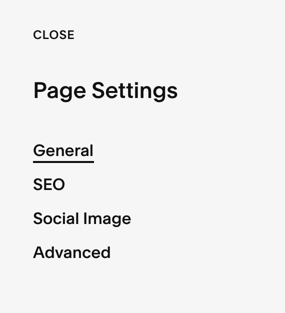
You can find this feature in page settings, then click on SEO.
Speaking of making your page clear, it’s important to use headings correctly. Choose accurate, searchable terms for your h1, h2, and h3 headers. Try to match your h1 header with the SEO title that you selected above. Following these steps will help Google (and your viewers) better understand and categorize your page.
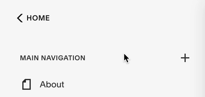
Keep your page templates consistent
As visitors explore your website they want it to be easy to find the information they are looking for. Although there are multiple great looking page templates available from Squarespace, try to limit the number you use throughout the entirety of your website. Visitors shouldn’t have to deal with a new layout with each and every page on your website, that’s a great way to get them to get frustrated and leave.
Don’t neglect mobile view
While designing your pages, click on the Mobile Preview button to see how your page looks on a mobile device.

Over 50% of all internet traffic is now on mobile, so it’s worth it to take some extra care designing the mobile version of your site. Squarespace automatically scales your page down in a responsive way. However, there are still important design elements to consider:
Mobile logo max-height
You are able to change the size of your logo in the “Site Title and Logo” section while editing your site header. In the same section, change the Mobile Logo Max-Height to something appropriate for your logo. This ensures it doesn’t take up too much of your screen when your page is shrunk down to a mobile view.
Image focal point
Viewing your webpage in a portrait orientation or on a smaller resolution mobile screen will affect how your images display, potentially cropping some of the image off. Moving the Focal Point ensures that the subject of your image remains visible as the image is sized and cropped.
Following these tips will help optimize your Squarespace SEO and design. Leverage the templates, mobile view, and SEO tools Squarespace provides, and you’ll be climbing the Google ranks in no time. Or perhaps you’d like even more control over your design and SEO, and would prefer a custom website? Whether you’re starting fresh or have a stale website, INGKY provides both optimizing and developing services to take your website to the next level.
